CASE STUDY (03) ✦ GOOGLE ✦ 2025 – 2026
Designing the interactive layer of Google’s experience centers: the screens, objects, and control systems that turn offices into stories.
ROLE
Senior UX Designer
AGENCY
Elevate — for Google
SCOPE
Interactive UX/UI · Journey & Content Systems
TIMELINE
2025 – 2026

(A) CONTEXT
Three projects, one design problem: rooms with two kinds of users.
Google’s experience centers are physical spaces where the company hosts partners and customers. Rooms of LED walls, sensors, tagged objects, and screens that react to what visitors do. Across 2025–2026 I designed the interactive layer for three of them: a partner experience center in São Paulo, an immersion room program rolling out across Google’s offices, and an AI demo space in Dublin.
Every experience had to work for two very different people at once: the guest, who should feel something effortless and a little magical, and the host running the room, who may have had no training and no time to get any. Most decisions below come from serving both. São Paulo is built and operating. Dublin and the immersion room are in production, opening through 2027.
(B) SÃO PAULO — PARTNER EXPERIENCE CENTER · BUILT
One entry, many canvases.
The São Paulo partner center personalizes the whole space for every hosted visit. Welcome wall, accent lighting, demo hall screens, photo-op moment, all greeting the guest by name and brand. Making that cost one action instead of ten was the design problem. A single content entry, guest name and logo and brand color, fans out automatically to every canvas in the space, and on the day of the visit a receptionist triggers the whole takeover from a wall panel. One tap.
The centerpiece is an RFID-driven storytelling hall. Hosts place carved physical totems on a pedestal to launch immersive stories across paired LED arrays, biodiversity or smart cities or medical AI, with lighting and audio shifting in sync. I built the host-facing control panel around one principle the team held all project: one tap for the two things that matter, pause and language. Ideally the host never touches the panel at all. Everything ships bilingual, Portuguese first.
( RENDER ) IMMERSION HALL, TOTEM-ACTIVATED

( UI ) HOST CONTROL PANEL — ONE-TAP PAUSE & LANGUAGE

( RENDER ) RECEPTION — BRAND TAKEOVER STATE

( RENDER ) DEMO HALL — AMBIENT WELCOME

( RENDER ) DEMO NICHE — PRODUCT STORYTELLING

( RENDER ) LOUNGE — SELF-EXPLORE TOUCHSCREEN
(C) THE IMMERSION ROOM — MULTI-OFFICE PROGRAM · IN PRODUCTION
A presentation room you operate by touching the walls.
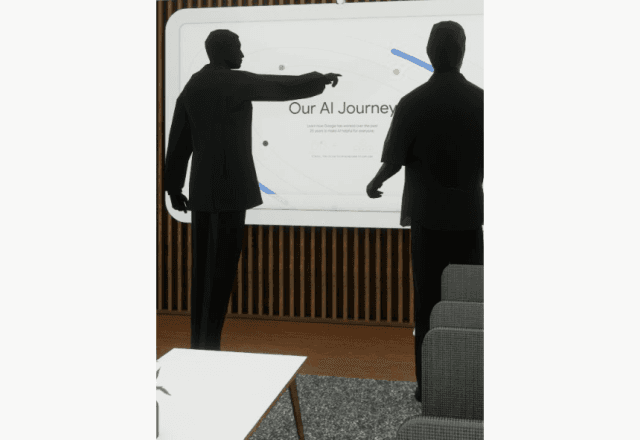
The immersion room is a productized space rolling out across Google’s offices: 270 degrees of LED, spatial audio, and a touch-enabled front wall where presenters run customer sessions from large tappable topic cards. I worked the core UX workstream with Google’s team, defining how the room behaves. The session arc, opening cinematic through closing photo moment. The card-based agenda model, the gesture language, and a control widget presenters summon by pressing a hand to the wall.
Persona work set the constraint. Most sessions are run by presenters who aren’t technologists, a range that runs from demo experts to executives hosting C-suite guests. So the model went tiered: an autoplay happy path that carries a polished session with almost no input, with layers of control underneath for presenters who know the room. We validated it the honest way, printing the design and testing it at full scale on the real LED walls with a tape measure in hand.
( RENDER ) THE CHAPTER MENU ACROSS THE 270° WALL

( UI ) CHAPTER NAVIGATION MOTION STUDY
(D) DUBLIN — AI DEMO SPACE · IN PRODUCTION
Making AI tangible enough to pick up.
Dublin’s demo space makes Google’s AI story physical. The flagship interaction is a lounge coffee table with carved wooden totems. Place one on the reader and a curated playlist of YouTube Shorts launches on the table’s screen, themed to whatever object is in your hand. I designed the full loop: an ambient attract state cycling previews, the launch moment, playback with easter eggs like a flutter of hearts when you tap the like button, and autoplay into the next Short.
Around it sits a system of operator-configurable surfaces. LED headers with a fully specced playout system covering type sizes, character limits and idle behaviors, plus a showcase wall of looping feature stories. All of it localized for Dublin, down to a gallery of Irish-language idioms visitors can reinterpret through Gemini. Like the immersion room, it opens with the rest of the program through 2027.
( RENDER ) THE AI COFFEE TABLE

( PROCESS ) TOTEM-TO-SHORT UX FLOW

(E) WHAT CARRIED ACROSS ALL THREE
( 1 )
TWO USERS, ONE ROOM
Every screen serves the guest and the untrained host at once: delight up front, one-tap control underneath.
( 2 )
SYSTEMS OVER SCENES
Templates and content systems rather than one-off screens, so the spaces stay current without a designer in the loop.
( 3 )
DESIGN AT HUMAN SCALE
Walls, tables, and totems get validated on real hardware at real size, because a UI that works on a laptop can fall apart on a twenty-foot wall.
NEXT PROJECT (04)